Create a Circular Progression Bar in Canvas Apps (Part 1)
- vikashsingh01
- Mar 10, 2024
- 10 min read
Updated: Jul 19, 2024
Table of Contents
This is what we're going to build:

Author's Note: For the quickest implementation, skip to ‘3) Enough of SVG technicalities, show me how to make the progression bar!’- You may want to do this if you are already familiar with SVGs and how they work in Canvas Apps. If not, it may be best to start from the beginning. Credit to the YouTube video 'Quick Guide- SVG Radial Progress Bar'.
While I was working on an annual leave app, one of the main requirements was to let users see their remaining leave allowance visibly and easily. Although a simple Label control to say "You have _ days remaining" would have sufficed, I wanted some sort of visual representation. That is when I knew I wanted to do a circular progression bar.
So, why go through all the effort of trying to accomplish this? Two reasons:
🔍 Visual Clarity: Progression bars provide a clear visual representation of progress, making it easy for users to grasp how much leave they've used and what remains at a glance.
🌀 Intuitive Representation: The circular shape can be associated with a cycle, reinforcing the idea of annual leave renewal as the allowance refreshes annually.
If you’re not used to working with SVGs, perhaps you’re thinking:
1) What is an SVG and why do I care?
Great question my theoretical and intrepid reader! If you weren’t thinking this you’re in luck as I'll explain it anyways. SVG stands for Scalable Vector Graphics and they are vector-based files that can be scaled up and down without losing quality. Because they are not pixel-based like PNG or JPEG, they are not ideal for overly large/detailed images. However, for this very reason, they are great for logos, icons and basic graphics.


2) That’s great, now how do I use an SVG in a Canvas App?
Let’s get started by creating a New App. Give it any name you like and choose a format - this doesn't matter but for this post, I will be working in a Phone format.

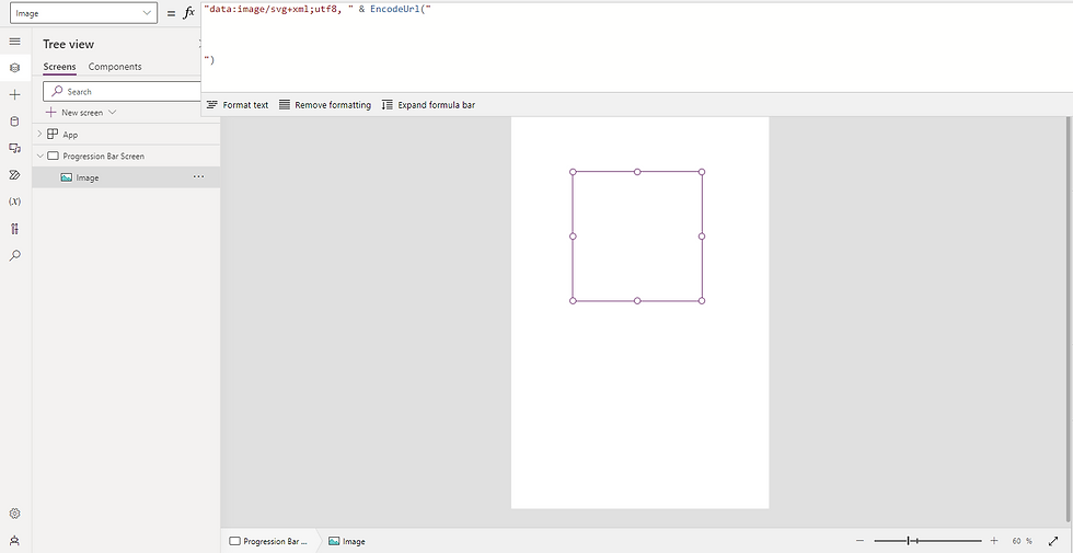
Insert an Image control on the screen and in Image property insert the following code:
"data:image/svg+xml;utf8, " & EncodeUrl("


")
Shown above is essentially what you need to use when working with SVGs in Canvas Apps. Now, have a try at going to Bootstrap Icons (https://icons.getbootstrap.com/), find an icon you like, and copy the HTML code:

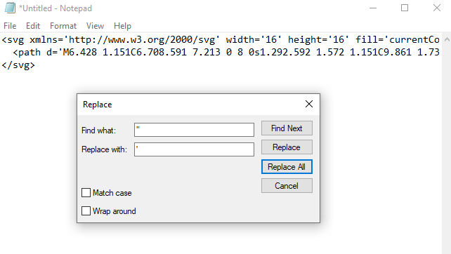
Attempting to insert this within the Image control now will result in an error and the SVG won’t appear - this is a ‘gotcha’ that may trip you up without knowing otherwise. What you need to do is to replace every speech mark (“) with a single apostrophe (‘). An efficient method to achieve this is by pasting the code into Notepad, doing a Ctrl+H and doing a Replace All as such:
With your code now in a workable format, you should be able to place it in between the opening and closing lines of code of the Image control similar to this:
"data:image/svg+xml;utf8, " & EncodeUrl("

<svg xmlns='http://www.w3.org/2000/svg' width='16' height='16' fill='currentColor' class='bi bi-airplane' viewBox='0 0 16 16'> <path d='M6.428 1.151C6.708.591 7.213 0 8 0s1.292.592 1.572 1.151C9.861 1.73 10 2.431 10 3v3.691l5.17 2.585a1.5 1.5 0 0 1 .83 1.342V12a.5.5 0 0 1-.582.493l-5.507-.918-.375 2.253 1.318 1.318A.5.5 0 0 1 10.5 16h-5a.5.5 0 0 1-.354-.854l1.319-1.318-.376-2.253-5.507.918A.5.5 0 0 1 0 12v-1.382a1.5 1.5 0 0 1 .83-1.342L6 6.691V3c0-.568.14-1.271.428-1.849m.894.448C7.111 2.02 7 2.569 7 3v4a.5.5 0 0 1-.276.447l-5.448 2.724a.5.5 0 0 0-.276.447v.792l5.418-.903a.5.5 0 0 1 .575.41l.5 3a.5.5 0 0 1-.14.437L6.708 15h2.586l-.647-.646a.5.5 0 0 1-.14-.436l.5-3a.5.5 0 0 1 .576-.411L15 11.41v-.792a.5.5 0 0 0-.276-.447L9.276 7.447A.5.5 0 0 1 9 7V3c0-.432-.11-.979-.322-1.401C8.458 1.159 8.213 1 8 1c-.213 0-.458.158-.678.599'/></svg>

")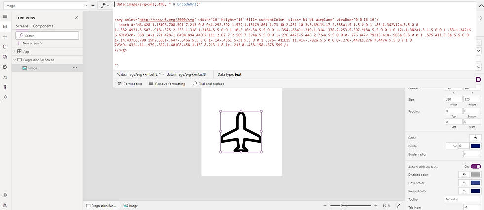
Try zooming into the icon in your app, you’ll notice that it doesn't lose its quality no matter how much you zoom in!
3) Enough of SVG technicalities, show me how to make the progression bar!
Let’s rewind by removing the inserted SVG code to get back to where we were originally:
"data:image/svg+xml;utf8, " & EncodeUrl("


")
Insert the following SVG code:
"data:image/svg+xml;utf8, " & EncodeUrl("
<svg viewBox='0 0 100 100' xmlns='http://www.w3.org/2000/svg'>
<circle cx='50' cy='50' r='40' stroke='rgba(245,246,250,1)' stroke-width='12' fill='rgba(0,0,0,0)'/>
</svg>
")
This code provides the foundation for the progression bar. Below is an explanation for the attributes used - if you're not interested feel free to skip this but is worth the read!
viewBox ='0 0 100 100'
Defines the coordinate system and the viewport, in this case, it’s a 100x100 box starting from the top-left corner (0,0)
xmlns='http://www.w3.org/2000/svg':
Specifies the XML namespace for SVG.
<circle>
The SVG element to create a circle
cx='50' cy='50'
The center coordinates of the circle. Places the centre at (50,50) within the 100x100 viewBox.
r='40'
Radius of the circle, set to 40 units.
stroke='rgba(245,246,250,1)'
The colour of the circle’s outline (stroke). It is set to a light grey colour - this can be changed to fit your preference but it will sit below the main progression circle. Ideally, this should be a subtle colour.
stroke-width='12'
The width of the outline of the circle, set to 12 units.
fill='rgba(0,0,0,0)'
The colour of the area within the circle. Here it is transparent (alpha = 0), so there is no visible fill inside the circle.
You can try altering these to watch how the circle changes visually, but be sure to change it back once you’re done to proceed with the rest of this post.
The next step is to get the second circle, luckily this won’t require a separate Image control as we can do it within the same one we’ve been working in. Insert the following code into your Image control:
"data:image/svg+xml;utf8, " & EncodeUrl("

<svg viewBox='0 0 100 100' xmlns='http://www.w3.org/2000/svg'>
    <circle cx='50' cy='50' r='40' stroke='rgba(245,246,250,1)' stroke-width='12' fill='rgba(0,0,0,0)'/>
    <circle cx='50' cy='50' r='40' stroke='rgba(245,134,43,1)' stroke-width='12' fill='rgba(0,0,0,0)'/>
</svg>

")
What’s just happened is we’ve added an identical orange circle into the code. Try changing the r attribute (radius) of either circle from 40 to 20 - you’ll see how the light grey circle is still here - it is just hiding beneath the orange circle!
Now we need to use maths to be able to measure and display how ‘filled up’ our second circle is - this sounds more daunting than it is. We’ll need to add two new attributes to our second circle of stroke-dasharray and stroke-dashoffset:
"data:image/svg+xml;utf8, " & EncodeUrl("

<svg viewBox='0 0 100 100' xmlns='http://www.w3.org/2000/svg'>
    <circle cx='50' cy='50' r='40' stroke='rgba(245,246,250,1)' stroke-width='12' fill='rgba(0,0,0,0)'/>
    <circle cx='50' cy='50' r='40' stroke='rgba(245,134,43,1)' stroke-width='12' fill='rgba(0,0,0,0)' stroke-dasharray='251' stroke-dashoffset='" & varDashoffset & "'/>
</svg>

")
This will give us an error as we haven’t Set the variable varDashoffset anywhere in the app as of yet - that is okay as that is the next step. Below is an explanation of the two new attributes we’ve just added. Again, this can be skipped but is worthwhile to read it:
stroke-dasharray='251'
This defines the pattern of dashes and gaps in the stroke.
This attribute is usually intended to be given a list of comma-separated values like ‘5,10’ - this would create a pattern with dashes of length 5 units followed by gaps of length 10 units, and this pattern would repeat around the circle.
Here It is set to 251 - the approximate circumference of a circle with a radius of 40. This means there will be one continuous dash (i.e. a solid line) along the entire circle
stroke-dashoffset=' " & varDashoffset & " '
This attribute specifies the distance into the dash pattern at which to start the dash. By changing this value, you can effectively shift the entire dash pattern along the path or shape.
This is what tells the Image where to how ‘full’ it should be and we are dynamically doing this with the variable varDashoffset.
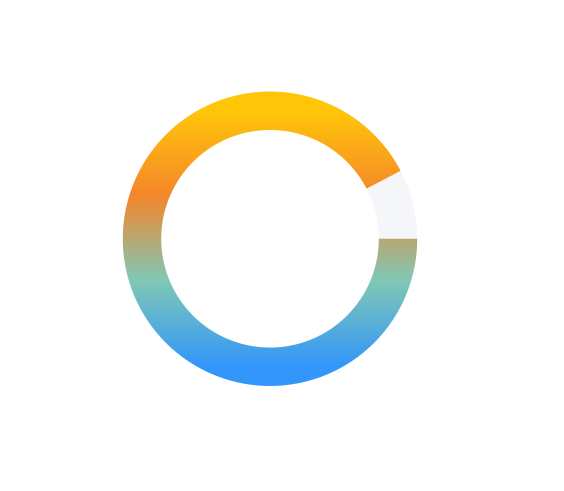
This stroke-dasharray and stroke-dashoffset business sounds a little bit complicated but I found this handy GIF which helps visualise it (credit to this blog post by Hi Interactive):

Let’s start with getting the progress to show using static values to begin with.
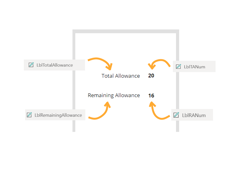
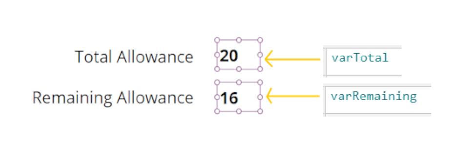
I’ve added 4 Label controls to the screen, only the labels on the right are needed but for demonstration and clarity purposes, I have included the two labels on the left:
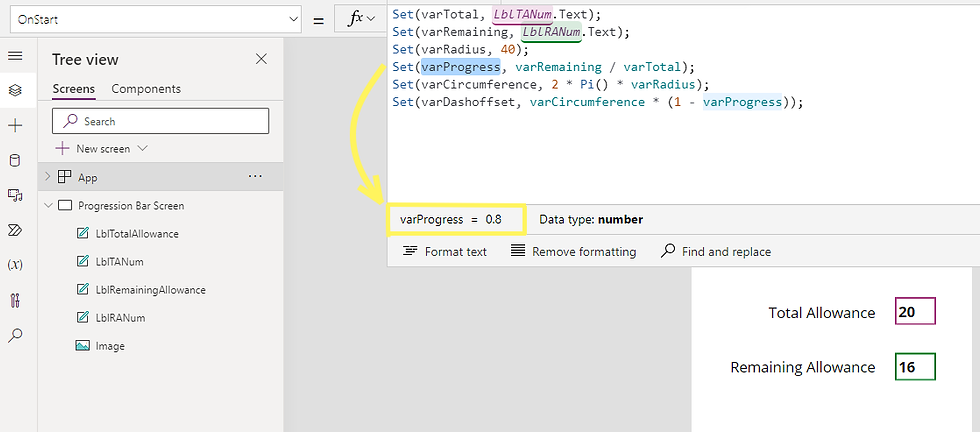
Now go to the App’s OnStart and enter the following code:
Set(varTotal, LblTANum.Text);
Set(varRemaining, LblRANum.Text);

Set(varRadius, 40);
Set(varProgress, varRemaining / varTotal);
Set(varCircumference, 2 * Pi() * varRadius);
Set(varDashoffset, varCircumference * (1 - varProgress));
Explanation:
The varProgress variable divides the Remaining value by the Total, in this case, this would be 16/20 = 0.8 (or 80%). Remember, the formula for circumference is calculated by the formula: Circumference = 2 x π x r.
Finally, varDashoffset is a calculation performed to tell the SVG where the measure of how ‘filled up’ the progression should start.
💡 Tip: After you’ve run the App’s OnStart, you can see the value contained inside of each variable by highlighting it - this is providing there are no errors in the App’s OnStart. This also works with Collections. This is one of the most powerful tools when it comes to understanding and troubleshooting PowerFx code in Power Apps, so use it!
Run the App’s OnStart, now you’ll see the SVG appears again because we have declared varDashoffset. On top of that, It looks as expected, 80% filled up! Try changing the 20 and or the 16 from the Labels and running the OnStart, you should find the SVG represents the difference accordingly:

4) How do I make this update via an action e.g. a button click?
We’ll need to do some moving around of variables. Click on the right-hand labels and change their Text property from static numbers to the variables as shown:
Then, replace the code in your OnStart code with this:
Set(varTotal, 20);
Set(varRemaining, 16);

Set(varRadius, 40);
Set(varProgress, varRemaining / varTotal);
Set(varCircumference, 2 * Pi() * varRadius);
Set(varDashoffset, varCircumference * (1 - varProgress));
And run the OnStart again.
Add a text input and two buttons. Your screen should look a little something like this:
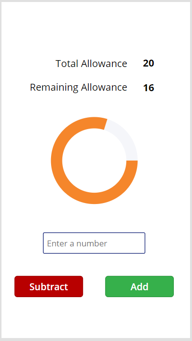
In the OnSelect property of the Add button, insert the following code:
//Rename TextInput with the name of your Text Input control
Set(varRemaining, varRemaining + TextInput.Text);
Set(varProgress, varRemaining / varTotal);
Set(varDashoffset, varCircumference * (1 - varProgress));
And do the same for the OnSelect property of the Subtract button:
//Rename TextInput with the name of your Text Input control
Set(varRemaining, varRemaining - TextInput.Text);
Set(varProgress, varRemaining / varTotal);
Set(varDashoffset, varCircumference * (1 - varProgress));
With that in place, you should be able to enter a number, click either button and watch the SVG update:
5) How can I get this to look at values dynamically so that it changes based on the logged-in user?
All this would require is to set our varTotal and varRemaining to the values which are in your data source. For example, say you wanted to use this progression bar to display how much annual leave an employee has remaining; if you have a data source which stores this information, you can do a simple LookUp to accomplish this. We would need to change varTotal and varRemaining to the values in said data source, but we can keep the rest of the code the same. The following code is just an example but it would look like this:
Set(varTotal, LookUp('Employees', User().Email = Email).'Total Leave');
Set(varRemaining, LookUp('Employees', User().Email = Email).'Remaining Leave');

Set(varRadius, 40);
Set(varProgress, varRemaining / varTotal);
Set(varCircumference, 2 * Pi() * varRadius);
Set(varDashoffset, varCircumference * (1 - varProgress));
💡 Tip: Often when you want to LookUp a value specific to the logged-in user, developers will tend to use Email or ID in the condition as we need to use something that remains unique and unchanging from person to person.
6) It looks a bit meh, can we make this look nicer?
Of course! We can introduce a gradient to this circular progression bar:
"data:image/svg+xml;utf8, " & EncodeUrl("

<svg viewBox='0 0 100 100' xmlns='http://www.w3.org/2000/svg'>

<defs>
    <linearGradient id='gradient' x1='0%' y1='0%' x2='0%' y2='100%'>
      <stop offset='0%' style='stop-color: RGBA(74, 159, 171, 1); stop-opacity: 1' />
      <stop offset='100%' style='stop-color: RGBA(180, 210, 193, 1); stop-opacity: 1' />
    </linearGradient>
  </defs>

    <circle cx='50' cy='50' r='40' stroke='rgba(245,246,250,1)' stroke-width='12' fill='rgba(0,0,0,0)'/>
    <circle cx='50' cy='50' r='40' stroke='url(#gradient)' stroke-linecap='butt' stroke-width='12' fill='rgba(0,0,0,0)' stroke-dasharray='251' stroke-dashoffset='" & varDashoffset & "'/>

</svg>

")
Two things have changed here - firstly we have added the <defs> (definition) element that allows us to have a colour gradient. Secondly, the second circle has changed its stroke attribute to stroke='url(#gradient)', this allows the second circle to use the gradient we define in the <defs> element:

Try changing the values of the rgba, you can essentially make more colour combinations than you’ll ever need. On top of this, you can add more than just two colours by increasing the number of <stop> elements like this:
"data:image/svg+xml;utf8, " & EncodeUrl("

<svg viewBox='0 0 100 100' xmlns='http://www.w3.org/2000/svg'>

<defs>
    <linearGradient id='gradient' x1='0%' y1='0%' x2='0%' y2='100%'>
        <stop offset='0%' style='stop-color:rgba(255,198,8,1); stop-opacity:1' />
        <stop offset='33%' style='stop-color:rgba(245,134,43,1); stop-opacity:1' />
        <stop offset='66%' style='stop-color:rgba(128,200,180,1); stop-opacity:1' />
        <stop offset='100%' style='stop-color:rgba(50,150,250,1); stop-opacity:1' />
    </linearGradient>
</defs>

    <circle cx='50' cy='50' r='40' stroke='rgba(245,246,250,1)' stroke-width='12' fill='rgba(0,0,0,0)'/>
    <circle cx='50' cy='50' r='40' stroke='url(#gradient)' stroke-linecap='butt' stroke-width='12' fill='rgba(0,0,0,0)' stroke-dasharray='251' stroke-dashoffset='" & varDashoffset & "'/>

</svg>

")
💡 Tip: You can change stroke-linecap=’butt’ to stroke-linecap='round' to give a curved edge. I’ve not used it in the below image but I have for the next example:
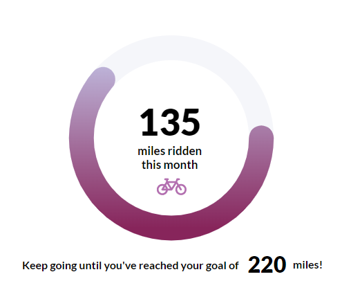
You can do some exciting things with this circular progression bar. How about when you've just made a Canvas App and you want to encourage people to ride their bike more often?
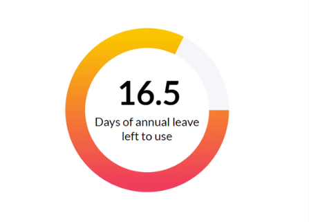
Or going back to how I came to make this post in the first place, for the annual leave app I was making:
Not to sound cliché but the possibilities here really are endless. Putting it all together you can make some really smart user interfaces. I will show one last example to toot my horn:
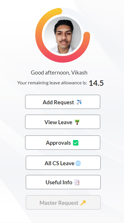
What a handsome chap! He looks just like me except with a better haircut! Although someone should really tell this guy to lose the moustache...
That’s all this time! I wanted to walk you step-by-step through how I came upon this idea and kept on developing it in the hopes that you may learn a thing or two from my discoveries.
In addition, you can read my Part 2 post which extends this idea further; there you will learn how we can allow users to customise and save the colour preferences of their progression bar.
If you find any errors or issues either with the code itself or the instructions I have provided, please let me know! Either leave a comment or feel free to message me on LinkedIn - your contributions will help to make these posts better and improve readability for future readers.

Comments