Glassmorphism in Power Apps (Part 1)
- vikashsingh01
- Feb 21, 2025
- 5 min read
Table of Contents
Introduction
Design trends come and go pretty damn fast, but some trends stick because they’re just plain beautiful. Enter glassmorphism, the design aesthetic that gives a ‘frosted glass’ like look to it.
You typically see glassmorphism used in front of gradients or backgrounds with lots of visual noise - it helps to add depth and a sense of layering, making elements stand out while maintaining a sense of continuity with the background. Here’s a great example I found just to demonstrate:

The image below illustrates the sequence of effects that come together to create the sleek and modern appearance of glassmorphism:

The aim of this blog post will be to follow this similar gradual building of effects to something that resembles what is seen on the right of the image.
But wait, in Power Apps? Frosted glass? Isn't that like putting a top hat on a spreadsheet? You can do a surprising amount with Power Apps UI nowadays, and by the end of this post, you'll know how to create glassmorphism elements in your own apps.
Basic 🌱
Start by adding a background image to your app. You can use any image you like, but if you'd like to follow along, the one I’m using can be found here (credit to Richard Horvath).
Add an Image control to your screen.
Stretch the image to cover the entire screen by expanding its width and height to fill all corners.

If you’re not sure how to add images to a Power App, check out this helpful video.
Next we’ll add a Html Text control to the screen and set the position, size and padding as shown below:

When you add the HTML Text control, the text won’t appear white like in the above image. I’ve changed it intentionally to increase visibility.
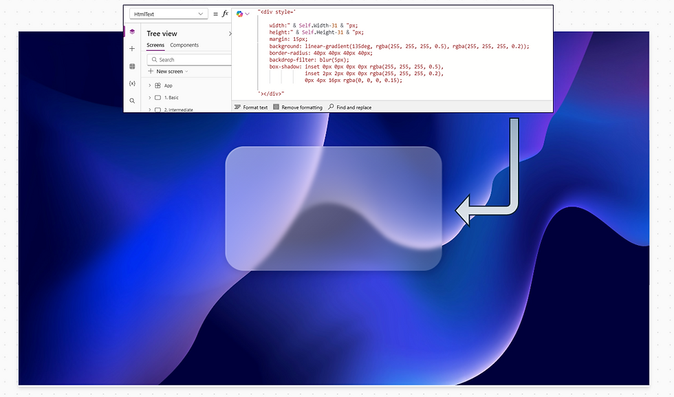
Now we’ll be setting the foundation for the glassmorphic element, copy and paste the below code into the HtmlText property.

This code will:
Tell the Html Text control how to set the dimensions by using the width and height properties. The ‘-1’ will account for a slight overflow of height. If you try removing this you will find that the control becomes scrollable (which isn’t desired).
Set the background to a transparent white fill.
The rgba means ‘red green blue alpha’ - alpha is the aspect which determines transparency:
0 = invisible
0.01 - 0.99 = varying levels of transparency
1 = fully opaque
Intermediate 🌿
With the foundation set, now we want to start making it look like glassmorphism with the signature rounded edges and blur. Copy and paste the below code into the same HtmlText property.

We’ve now added:
The border-radius property to enable us to get rounded edges. The usage of ‘40px’ four times is used to define each specific corner of the border in the following sequence:
Top-left corner (40px)
Top-right corner (40px)
Bottom-right corner (40px)
Bottom-left corner (40px)
If you wanted to define all borders in one go, you can instead use: border-radius: 40px;
And backdrop-filter is used to add the blur effect. It is set to 5px - lowering this or increasing this make the effect lighter or stronger accordingly.
Next, let’s upgrade the background from a flat, solid fill to a gradient. We’ll also add a direction to it to make it look as if it is transferring light from a light source. Copy and paste the code below into the same HtmlText property:

Now the code has been modified so:
Rather than using just one colour, we can declare more than two colours as well as the angle of the gradient using linear-gradient.
rgba(255, 255, 255, 0.5): The first color (white with 50% transparency).
rgba(255, 255, 255, 0.2): The second color (white with 20% transparency).
135deg: The angle (direction) of the gradient - can be changed to alter the angle.
Advanced 🌳
This is where we are going to get into those extra elements that really bring the glassmorphic effect to life. Copy and paste the code below into the same HtmlText property:

We have now:
Added a gradient border using the box-shadow property - it is thin on purpose and only coming from the top-left to elevate the current look of light being transferred from the top-left of the element to the bottom right.
Although I would try to explain this property more in depth, it is better to have a go at changing the values for yourself to see how the element changes accordingly.
Lastly, we will add the finishing touch - copy and paste the code below into the same HtmlText property:
Finally, we have completed the glassmorphic look, and to achieve it we have added:
0px 4px 16px rgba(0, 0, 0, 0.15) to the box-shadow property, this is what adds the subtly shadow to the outside of the element
margin: 15px - without this the outside shadow would have an obvious cut off point and look boxy.
And lastly changed the width and height to have a ‘-31’ pixel to account for the margin either side (15px x 2 as well as an extra pixel to account for overflow).
Now we can finish this off by adding some labels and icons to make this look like a credit card - this is one of the most popular uses of glassmorphism:
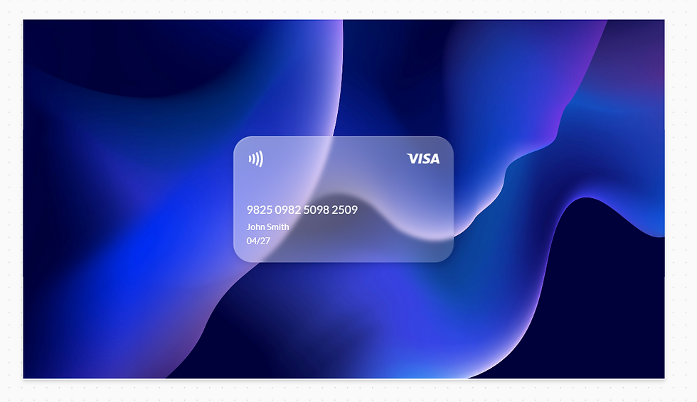
Icons from: SVG Repo - Free SVG Vectors and Icons
Visa Icon: Visa Vector SVG Icon (26) - SVG Repo
Contactless Icon: Contactless 1 Vector SVG Icon - SVG Repo
💡 Tip: You can edit the colours of the icons before you export them (as either code or image files).
We’ve now covered all the key elements needed to achieve the glassmorphism/frosted glass effect. Below, you'll find some helpful tips and tricks.
Glassmorphism Generator
A neat tool you can use is the Claymorphism CSS Generator to easily get the code for an element whilst visually seeing how it changes with the sliders.

When you have the desired look, simply copy the below HTML snippet and replace accordingly:
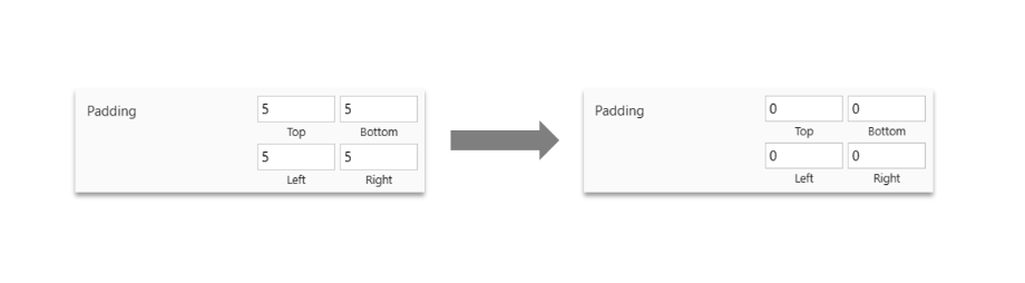
Don’t forget to remove the padding that comes default with the Html Text control. I like to do this for all Html Text controls I use.
General Tips
1. Ensure that text and graphics have enough contrast to improve accessibility. This can usually be achieved by increasing the blur.
2. Use vibrant background colours to help you get the signature glass effect. Using a dark-coloured background can work, but be mindful that there should be something visually interesting happening too like patterns to textures to help accentuate the frosted glass effect - otherwise it will risk looking flat.
3. Use a gradient fill over a solid fill for your glassmorphic elements to help add visual depth. As a bonus, make sure the direction of the gradient isn’t just going top-down, but instead coming at an angle.
4. Use border highlights to emphasise edges and contribute to the airy, lightweight feel of the design. These are best kept light and minimalistic and work well when they are angled at the same or similar angle to the gradient fill.
5. Use backdrop shadows to make glassmorphic elements appear more dynamic and as if they are floating above the background.
Conclusion
You’re now a glassmorphism pro! I’d drop some mock-ups here, but this post is getting a little crowded - let’s continue this in Part 2 (when I upload it)!


Comments