Glassmorphism in Power Apps (Part 2)
- vikashsingh01
- Apr 1, 2025
- 6 min read
Updated: Apr 1, 2025
Table of Contents
Introduction
This is a continuation of my Part 1 post, where I demonstrated how to create glassmorphic elements in Power Apps from scratch. This post features example mock-ups I've made in Power Apps to push the effect even further as well as some useful tips including using AI to work hard for you, layout tips and more.
My focus here is more on explaining the process rather than diving into every line of code, though the code will still be provided for reference.
Desktop Designs

Design 1 - Entertainment Browsing

You may remember this from the Part 1 post. I decided to recreate it (with some tweaks) just to see if it's really possible to make a Power App look like this.
I first saw this design from here, although I’m not sure if that is the original source. Either way, credit to the original creator for the inspiration.
Code
The Process
Blurred Background Behind Glassmorphism?
This is one of those subtle strokes of genius that I can’t take credit for - just something I’ve picked up from others who’ve nailed it before me. Contrary to my advice in Part 1 of having a background with some sort of visual noise, this goes in the opposite direction and instead lowers the noise to create a cleaner, less focused environment that still lets glassmorphic elements sit nicely on top of it.
Instead of using a pre-blurred image from the web, I’ve found the best results come from taking a generic image of a domestic space (home, office, etc.) and applying the blur myself using a tool like PineTools.

This way, the blur feels more natural and controlled, creating the perfect backdrop.
Control Optimisation
One thing to really consider when you’re doing glassmorphism which may be heavily layered or ‘containerised’ is making sure that as few HTML controls are used as possible to optimise app loading times. One of the best ways to do this is to utilise galleries so that each control is only being used and recognised once, even if it visually appears x number of times.

Using Striking Colours Sparingly for an Enterprise Feel
When designing to get that enterprise app feel, less is often more - especially when it comes to colours. A clean, professional look doesn’t mean stripping out personality, but rather using bold, striking colours with intention.

I’ve found that small touches of vibrant colours, whether in buttons, highlights, or key UI elements, can create a sense of focus without overwhelming the design. It keeps things looking refined and polished while still adding just enough visual interest to make the interface feel engaging rather than dull.
Design 2 - Patient Medical Records
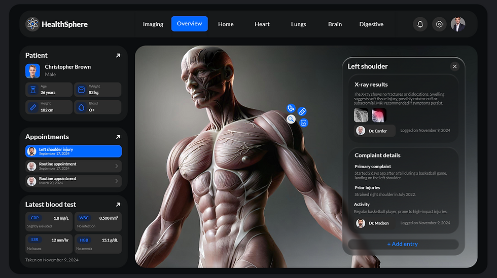
Inspiration from Shakuro on Dribble.
Code
The Process
Mastering Layouts Before Breaking Them
When designing an app, it’s easy to get caught up in making something unique. But more often than not, the best layouts are the ones that feel familiar. That’s why the Header-Menu-Content structure is so great.

It keeps elements organised, easy to navigate, and avoids unnecessary complexity.
I’ve made the mistake before of overcomplicating layouts or not fully using the available canvas space. A good layout isn’t just about cramming everything in - it’s about leading the user’s focus naturally.
So, my advice? Don’t waste time reinventing the wheel. Use tried-and-tested layouts so your effort goes into building useful features instead of wrestling with how and where elements should sit on the canvas.
That’s not to say you shouldn’t experiment - but first, master the rules and then you can start breaking them with confidence.
Using AI to Work Hard For Me
I’ll be the first to admit that I don’t always think about using AI to help me with new scenarios, even though it’s getting more powerful every day. But when I do, I’m reminded of how much time and effort it can save.
For this project, I used AI (Copilot) to generate an image of an anatomical structure - something I just couldn’t find the right version of online. Of course, as anyone who’s dabbled in AI image generation knows, you rarely get exactly what you want on the first try so you tweak your request until it finally comes out just right… but in some cases, you start with a simple anatomy request and end up staring at something that looks like it belongs on a very different kind of website. Please, for the love of HR, let this never come up in a background check.
Then, with the help of another tool (Pixelcut), I expanded and refined it, shaping it into exactly what I needed.

AI isn’t about replacing creativity; it’s about working smarter. And when used right, it’s like having an extra set of hands to do the heavy lifting.
Custom SVG Icons
I’ve been a firm believer in the power of SVGs ever since I first discovered them, and that hasn’t changed.
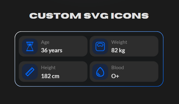
The little details are what truly elevate an app, and crisp, scalable icons make all the difference. I’ve explored plenty of sites for custom SVGs, but time and time again, I keep coming back to my personal favourite - SVG Repo.
Finally… Glassmorphism
In my Part 1 post, I talked about how glassmorphism works best when placed in front of a visually interesting background. Here, that rule is being slightly bent - only about 5% of something "visually interesting" sits behind the glassmorphic element. It’s a small exception, but one that still manages to keep the effect feeling intentional rather than out of place.

Mobile Designs

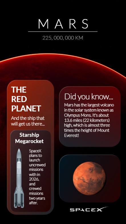
Design 1 - Planet Catalogue
Code
The Process
Unconventional Sizing and Positions
I deliberately chose unconventional sizes and placements for the glassmorphic elements to create a sense of depth - almost like floating UI components in zero gravity. This not only reinforces the space theme but also makes the design feel more dynamic and less rigid.
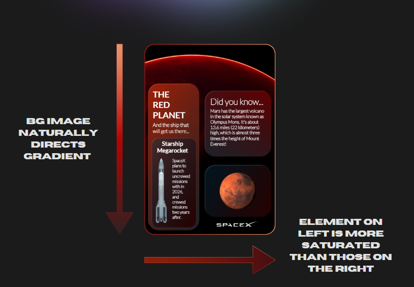
Lighting to Control User Attention
Another key design choice was using colour and lighting direction to subtly guide user focus. The planet in the background naturally frames the bottom of the screen, while its glowing edge helps control the gradient flow. Instead of relying on flat fills, shifting between two complementary colours adds visual interest.
You’ll also notice that the left-side element is the brightest - this isn’t random. It’s an intentional cue to draw attention, subtly signaling that this element holds more importance over those on the right. Small lighting decisions like these can make a big difference in how the user’s attention is directed as they use your apps.
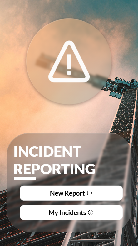
Design 2 - Incident Reporting
Code
The Process
Background: Found here.
Recognisable Icons to Instantly Convey Purpose
A simple, clean, and effective starting screen that tells the user exactly what the app is for - before they even read the Incident Reporting label.
With mobile Power Apps, you’re working with limited screen real estate, so every element needs to serve a purpose. Here, the warning icon does the heavy lifting, instantly signaling that this app deals with hazards or incidents, no extra explanation needed. If an app could yell "hey, something’s on fire!" without actually yelling, this would be it.
Oh, and that warning icon? Also straight from SVG Repo (not sponsored, I promise). But hey, SVG Repo, if you’re reading this… let’s talk.
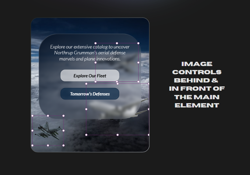
Design 3 - Aviation Info

Code
The Process
Background: Found here.
Accessibility
It’s easy to let accessibility slip when working with glassmorphism, especially when you want the texture of the background/graphics behind to shine through. To achieve more accessible text, I’ve made sure that the main glassmorphic element and label colour have enough contrast, as well as making sure it’s not too blurred to obstruct the background elements. It’s all about finding that balance between visual appeal and functionality, ensuring the design looks good and works well for everyone.
Layering Graphics/Images Behind and in Front of Elements
This is something I’ve not seen other people do, and so I was really experimenting here to add subtle depth to feel dynamic yet not out of place.
Conclusion
And there we have it - another deep dive into glassmorphism in Power Apps. We’ve covered everything from experimenting with simple layouts, unconventional layouts, using AI to do the heavy lifting (sometimes in ways that probably shouldn’t be shown to HR) and more.
Along the way, I’ve hopefully managed to show you that intuitive and functional designs don’t need to be overly complex, but just need a little bit of thought and attention to detail.


Comments